
 个人中心
个人中心 退出
退出


第一个h5页面
不废话,先爆照,不好勿喷
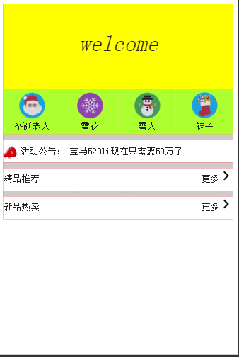
我用的软件是WebStorm开发,然后也知道了h5我们可以用谷歌浏览器点击右键,然后点击审查,就可以按照手机屏幕来看到页面
下面是项目的图片
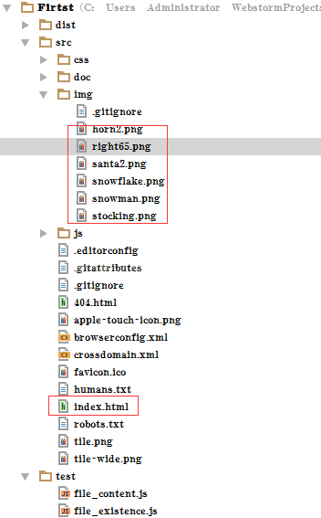
这个是我的index.html文件
<!doctype html>
<html class="no-js" lang="">
<head>
<meta charset="utf-8">
<meta http-equiv="x-ua-compatible" content="ie=edge">
<title></title>
<meta name="description" content="">
<meta name="viewport" content="width=device-width, initial-scale=1">
<link rel="apple-touch-icon" href="apple-touch-icon.png">
<!-- Place favicon.ico in the root directory -->
<link rel="stylesheet" href="css/normalize.css">
<link rel="stylesheet" href="css/main.css">
<script src="js/vendor/modernizr-2.8.3.min.js"></script>
</head>
<body>
<!--[if lt IE 8]>
<p class="browserupgrade">You are using an
<strong>outdated</strong> browser. Please <a
href="http://browsehappy.com/">upgrade your browser</a> to
improve your experience.</p>
<![endif]-->
<!-- Add your site or application content here -->
<div class="main">
<div class="head">
<span class="head_content" >
welcome
</span>
</div>
<div class="center">
<div class="one"><div
class="in"><img src="../src/img/santa2.png"
class="image"></div><div
class="value">圣诞老人</div></div>
<div class="one"><div class="in"><img
src="../src/img/snowflake.png" class="image"></div><div
class="value">雪花</div></div>
<div class="one"><div class="in"><img
src="../src/img/snowman.png" class="image"></div><div
class="value">雪人</div></div>
<div class="one"><div class="in"><img
src="../src/img/stocking.png" class="image"></div><div
class="value">袜子</div></div>
</div>
<div class="relax"></div>
<div class="item"><div ><img
src="../src/img/horn2.png" class="image1"><span
class="val">活动公告:</span><span
class="val1">宝马520li现在只需要50万了</span></div></div>
<div class="relax"></div>
<div class="item">
<div class="tuijian">精品推荐</div>
<div class="rightimg"><img
src="../src/img/right65.png" class="image1"
class="image1"></div>
<div class="gengduo">更多</div>
</div>
<div class="relax"></div>
<div class="item">
<div class="tuijian">新品热卖</div>
<div class="rightimg"><img
src="../src/img/right65.png" class="image1"
class="image1"></div>
<div class="gengduo">更多</div>
</div>
</div>
<script src="https://ajax.googleapis.com/ajax/libs/jquery/{{JQUERY_VERSION}}/jquery.min.js"></script>
<script>window.jQuery || document.write('<script src="js/vendor/jquery-{{JQUERY_VERSION}}.min.js"><\/script>')</script>
<script src="js/plugins.js"></script>
<script src="js/main.js"></script>
<!-- Google Analytics: change UA-XXXXX-X to be your site's ID. -->
<script>
(function(b,o,i,l,e,r){b.GoogleAnalyticsObject=l;b[l]||(b[l]=
function(){(b[l].q=b[l].q||[]).push(arguments)});b[l].l=+new Date;
e=o.createElement(i);r=o.getElementsByTagName(i)[0];
e.src='https://www.google-analytics.com/analytics.js';
r.parentNode.insertBefore(e,r)}(window,document,'script','ga'));
ga('create','UA-XXXXX-X','auto');ga('send','pageview');
</script>
</body>
</html>
然后再就是样式了
/*
* What follows is the result of much research on cross-browser styling.
* Credit left inline and big thanks to Nicolas Gallagher, Jonathan Neal,
* Kroc Camen, and the H5BP dev community and team.
*/
/* ==========================================================================
Base styles: opinionated defaults
========================================================================== */
html {
color: #222;
font-size: 1em;
line-height: 1.4;
}
/*
* Remove text-shadow in selection highlight:
* https://twitter.com/miketaylr/status/12228805301
*
* These selection rule sets have to be separate.
* Customize the background color to match your design.
*/
::selection {
background: #b3d4fc;
text-shadow: none;
}
/*
* A better looking default horizontal rule
*/
hr {
display: block;
height: 1px;
border: 0;
border-top: 1px solid #ccc;
margin: 1em 0;
padding: 0;
}
/*
* Remove the gap between audio, canvas, iframes,
* images, videos and the bottom of their containers:
* https://github.com/h5bp/html5-boilerplate/issues/440
*/
audio,
canvas,
iframe,
img,
svg,
video {
vertical-align: middle;
}
/*
* Remove default fieldset styles.
*/
fieldset {
border: 0;
margin: 0;
padding: 0;
}
/*
* Allow only vertical resizing of textareas.
*/
textarea {
resize: vertical;
}
/* ==========================================================================
Browser Upgrade Prompt
========================================================================== */
.browserupgrade {
margin: 0.2em 0;
background: #ccc;
color: #000;
padding: 0.2em 0;
}
/* ==========================================================================
Author's custom styles
========================================================================== */
/* ==========================================================================
Helper classes
========================================================================== */
/*
* Hide visually and from screen readers:
*/
.hidden {
display: none !important;
}
/*
* Hide only visually, but have it available for screen readers:
* http://snook.ca/archives/html_and_css/hiding-content-for-accessibility
*/
.visuallyhidden {
border: 0;
clip: rect(0 0 0 0);
height: 1px;
margin: -1px;
overflow: hidden;
padding: 0;
position: absolute;
width: 1px;
}
/*
* Extends the .visuallyhidden class to allow the element
* to be focusable when navigated to via the keyboard:
* https://www.drupal.org/node/897638
*/
.visuallyhidden.focusable:active,
.visuallyhidden.focusable:focus {
clip: auto;
height: auto;
margin: 0;
overflow: visible;
position: static;
width: auto;
}
.main{
/*margin-left: 150px;*/
/*margin-right: 150px;*/
height: auto;
/*border: 2px solid #212121;*/
/*border-radius: 20px;*/
background-color: red;
}
.head{
height: 150px;
background-color:#ffff00;
text-align: center;
font-style: oblique;
font-size: 40px;
line-height:140px;
}
.center{
height: 80px;
background-color:bisque;
position:relative
}
.one{
width: 25%;
height: 80px;
background-color:greenyellow;
float:left
}
.two{
width: 25%;
height: 80px;
background-color:rosybrown;
float:left
}
.three{
width: 25%;
height: 80px;
background-color:brown;
float:left
}
.four{
width: 25%;
height: 80px;
background-color:aquamarine;
float:left
}
.relax{
height: 10px;
background-color: #cccccc;
}
.item{
height: 40px;
background-color: white;
}
.head_content{
/*background-color:darkgray;*/
/*margin-top: 100px;*/
/*text-align: center;*/
/*line-height:80px;*/
}
.image{
width: 50px;
height: 50px;
margin: auto;
margin-top: 5px;
}
.in{
text-align: center;
}
.value{
text-align: center;
}
.left{
margin-top: 10px;
}
.tuijian{
margin-top: 8px;
float: left;
}
.gengduo{
float: right;
margin-top: 8px;
}
.rightimg{
float: right;
}
.val1{
margin-left: 15px;
}
/*
* Hide visually and from screen readers, but maintain layout
*/
.invisible {
visibility: hidden;
}
.image1{
/*margin-top: 4px;*/
width: 25px;
height: 25px;
}
.val{
line-height : 40px;
margin-top: 10px;
margin-left: 5px;
}
/*
* Clearfix: contain floats
*
* For modern browsers
* 1. The space content is one way to avoid an Opera bug when the
* `contenteditable` attribute is included anywhere else in the document.
* Otherwise it causes space to appear at the top and bottom of elements
* that receive the `clearfix` class.
* 2. The use of `table` rather than `block` is only necessary if using
* `:before` to contain the top-margins of child elements.
*/
.clearfix:before,
.clearfix:after {
content: " "; /* 1 */
display: table; /* 2 */
}
.clearfix:after {
clear: both;
}
/* ==========================================================================
EXAMPLE Media Queries for Responsive Design.
These examples override the primary ('mobile first') styles.
Modify as content requires.
========================================================================== */
@media only screen and (min-width: 35em) {
/* Style adjustments for viewports that meet the condition */
}
@media print,
(min-resolution: 1.25dppx),
(min-resolution: 120dpi) {
/* Style adjustments for high resolution devices */
}
/* ==========================================================================
Print styles.
Inlined to avoid the additional HTTP request:
http://www.phpied.com/delay-loading-your-print-css/
========================================================================== */
@media print {
*,
*:before,
*:after {
background: transparent !important;
color: #000 !important; /* Black prints faster:
http://www.sanbeiji.com/archives/953 */
box-shadow: none !important;
text-shadow: none !important;
}
a,
a:visited {
text-decoration: underline;
}
a[href]:after {
content: " (" attr(href) ")";
}
abbr[title]:after {
content: " (" attr(title) ")";
}
/*
* Don't show links that are fragment identifiers,
* or use the `javascript:` pseudo protocol
*/
a[href^="#"]:after,
a[href^="javascript:"]:after {
content: "";
}
pre,
blockquote {
border: 1px solid #999;
page-break-inside: avoid;
}
/*
* Printing Tables:
* http://css-discuss.incutio.com/wiki/Printing_Tables
*/
thead {
display: table-header-group;
}
tr,
img {
page-break-inside: avoid;
}
img {
max-width: 100% !important;
}
p,
h2,
h3 {
orphans: 3;
widows: 3;
}
h2,
h3 {
page-break-after: avoid;
}
}
总结:字房子中间样式
text-align: center;
行高要记住
line-height : 40px;
作者:chen.yu
深信服三年半工作经验,目前就职游戏厂商,希望能和大家交流和学习,
微信公众号:编程入门到秃头 或扫描下面二维码
零基础入门进阶人工智能(链接)
 分类导航
分类导航